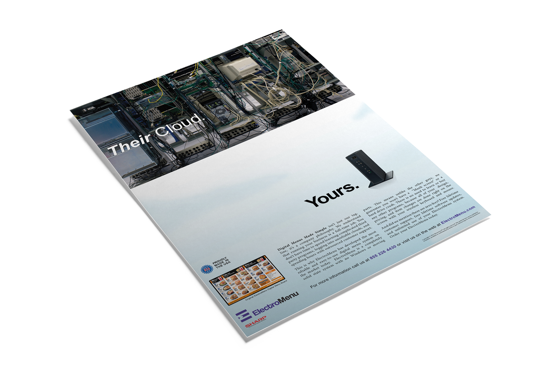
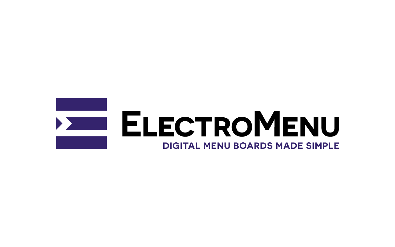
ElectroMenu is a Digital Menus and Electronic Menu Boards company that uses unique embedded technology that makes it easy to use and extremely reliable. The tagline in the logo sums it up perfectly, "Digital Menu Boards Made Simple".
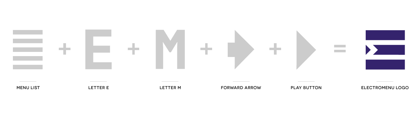
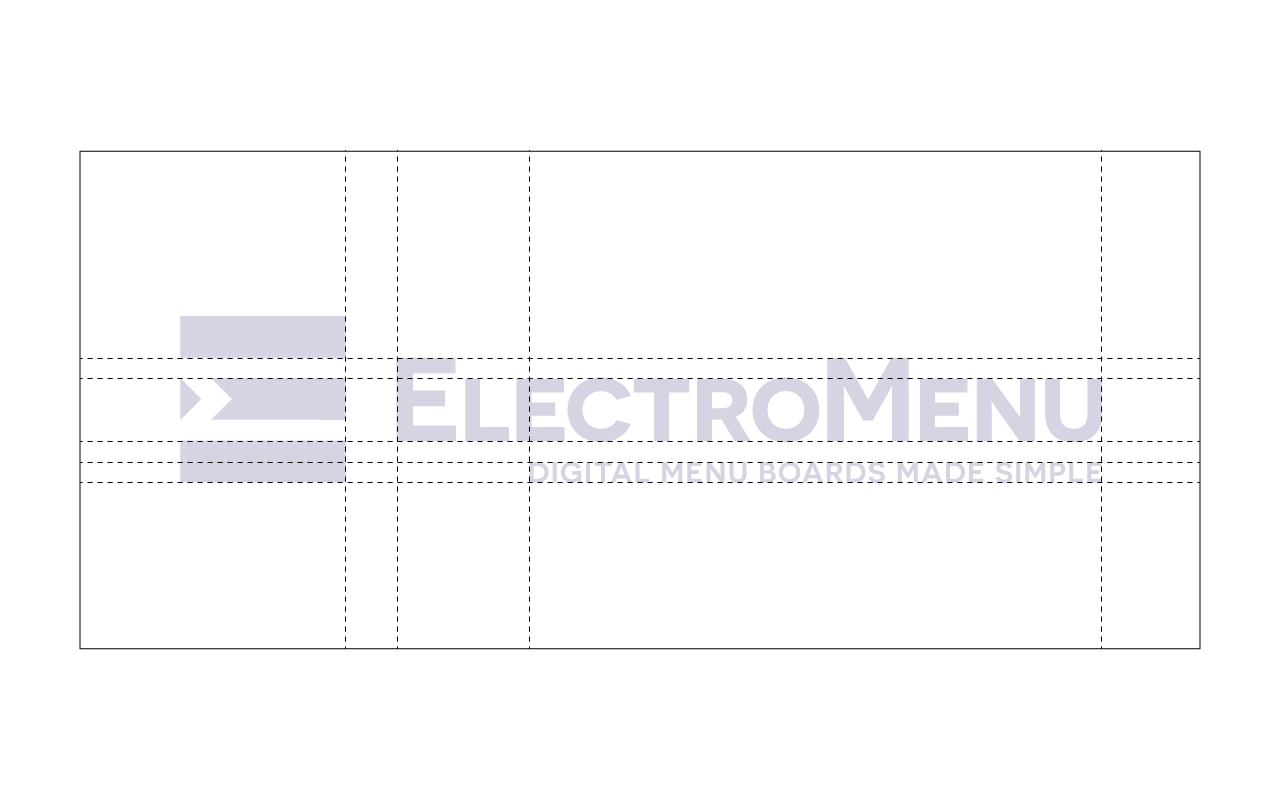
The logo reflects all of these things in its style and simplicity. The logo features the letter "E", with the negative space forming not only another "E" but a sideways-turned "M". It also incorporates an abstract menu list, using three rectangular shapes on top of each other, which is the format of most digital menu board designs. The ElectroMenu logo also incorporates a forward facing triangle, acting as both a play button and an arrow that represents forward progress and innovation.
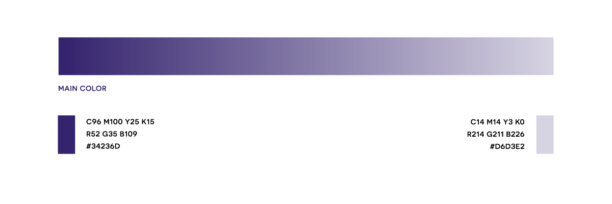
The color purple (which was chosen by the client) represents nobility, luxury, and creativity, all things that are staples of the ElectroMenu brand.
The logo reflects all of these things in its style and simplicity. The logo features the letter "E", with the negative space forming not only another "E" but a sideways-turned "M". It also incorporates an abstract menu list, using three rectangular shapes on top of each other, which is the format of most digital menu board designs. The ElectroMenu logo also incorporates a forward facing triangle, acting as both a play button and an arrow that represents forward progress and innovation.
The color purple (which was chosen by the client) represents nobility, luxury, and creativity, all things that are staples of the ElectroMenu brand.
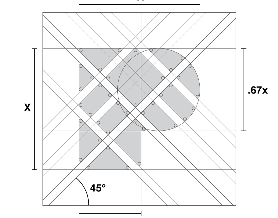
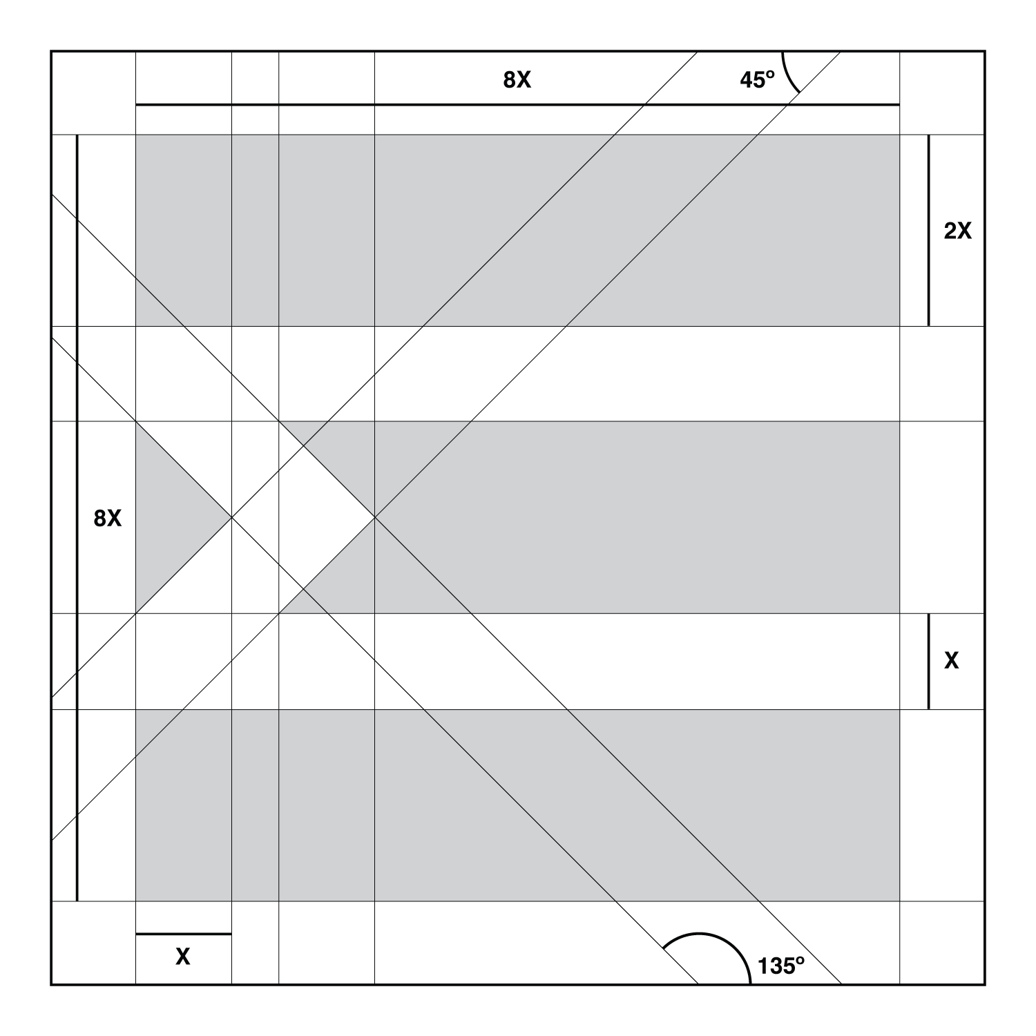
ElectroMenu Symbol Construction Process
ElectroMenu Symbol Grid Illustration
ElectroMenu Full Color Symbol

ElectroMenu Full Logo Dimensions
ElectroMenu Logo Black & White

ElectroMenu Full Color Logo
ElectroMenu Color Scheme
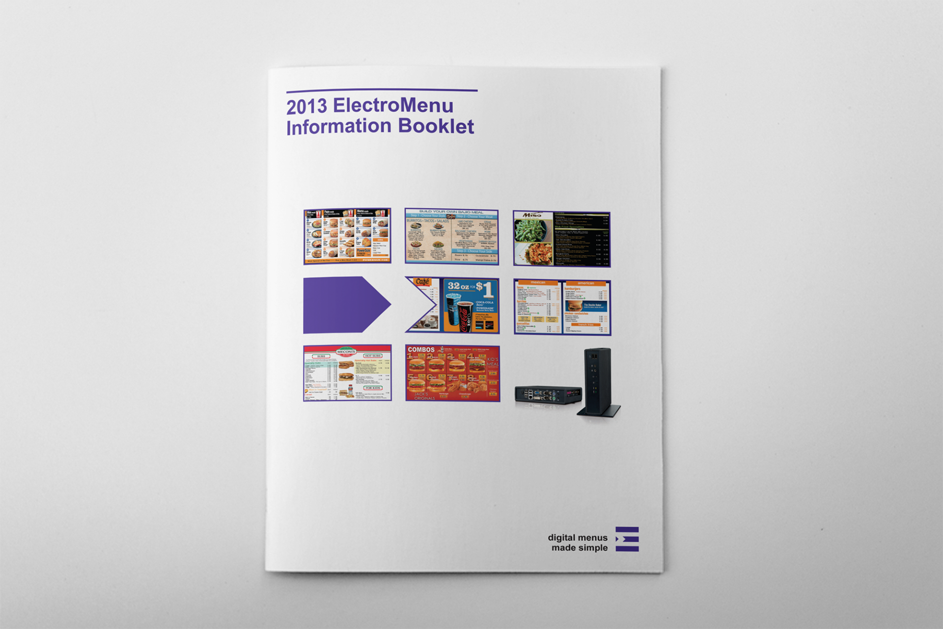
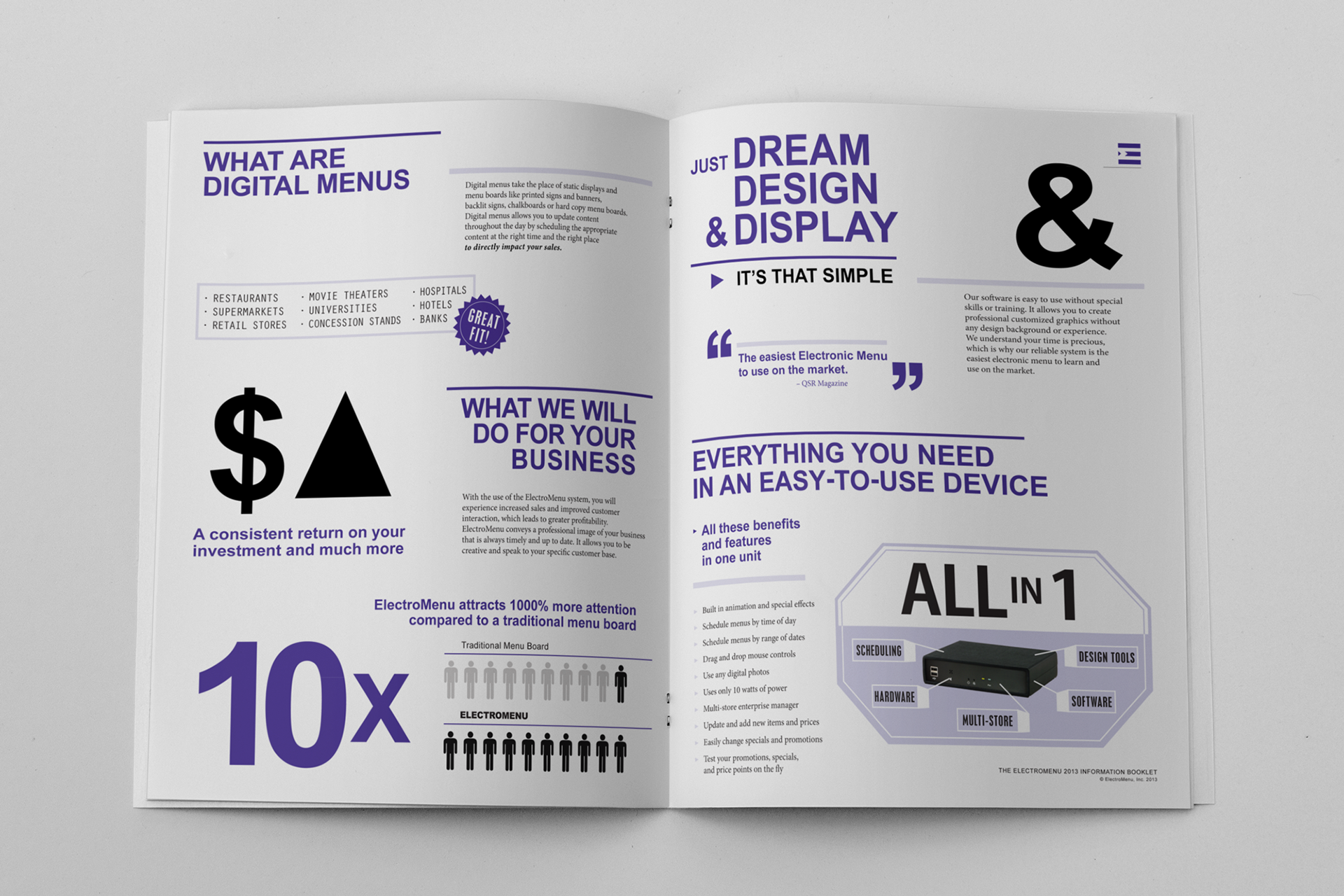
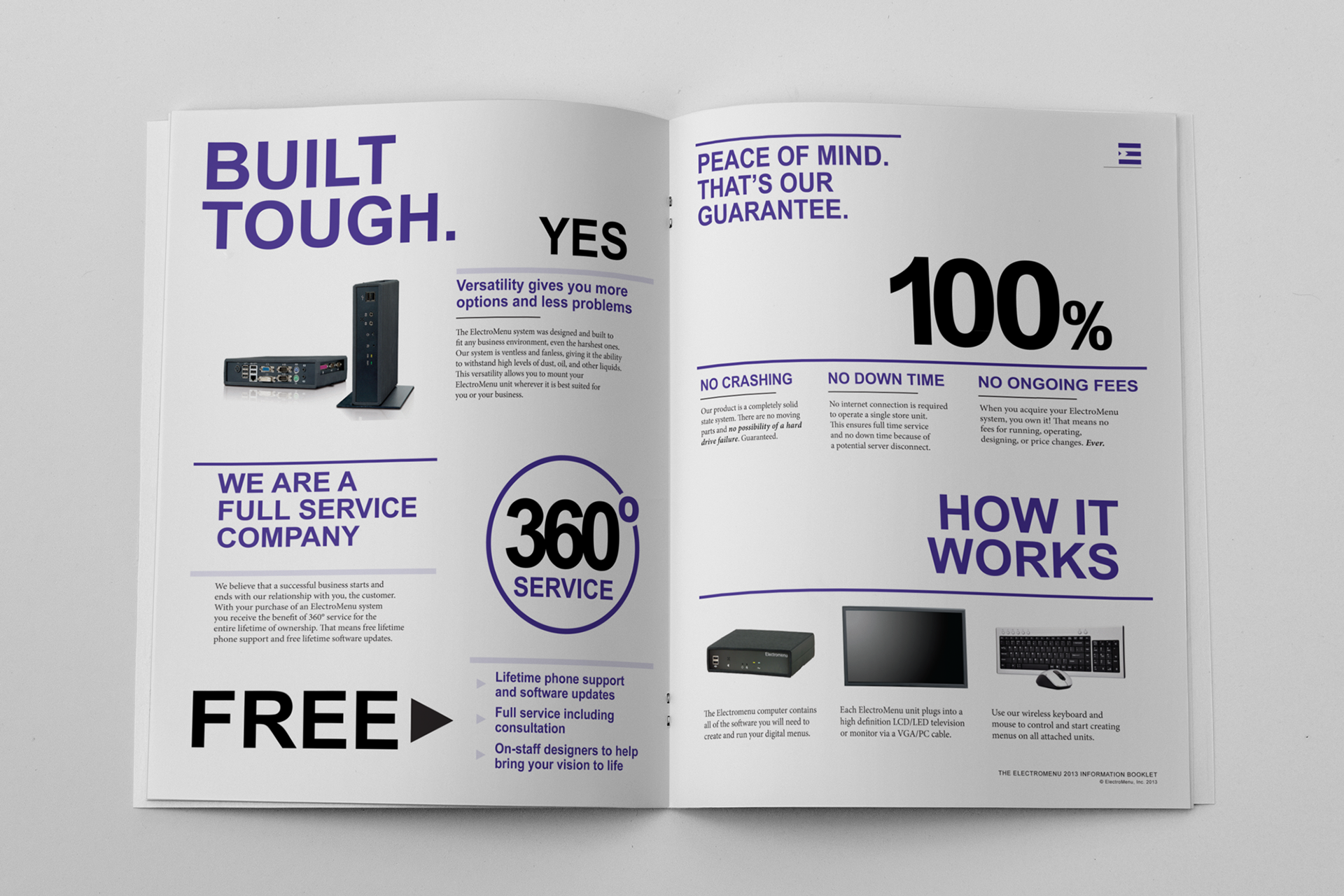
ElectroMenu Information Booklet

ElectroMenu Single Page Information Flyer

ElectroMenu Single Page Print Magazine Advertisement