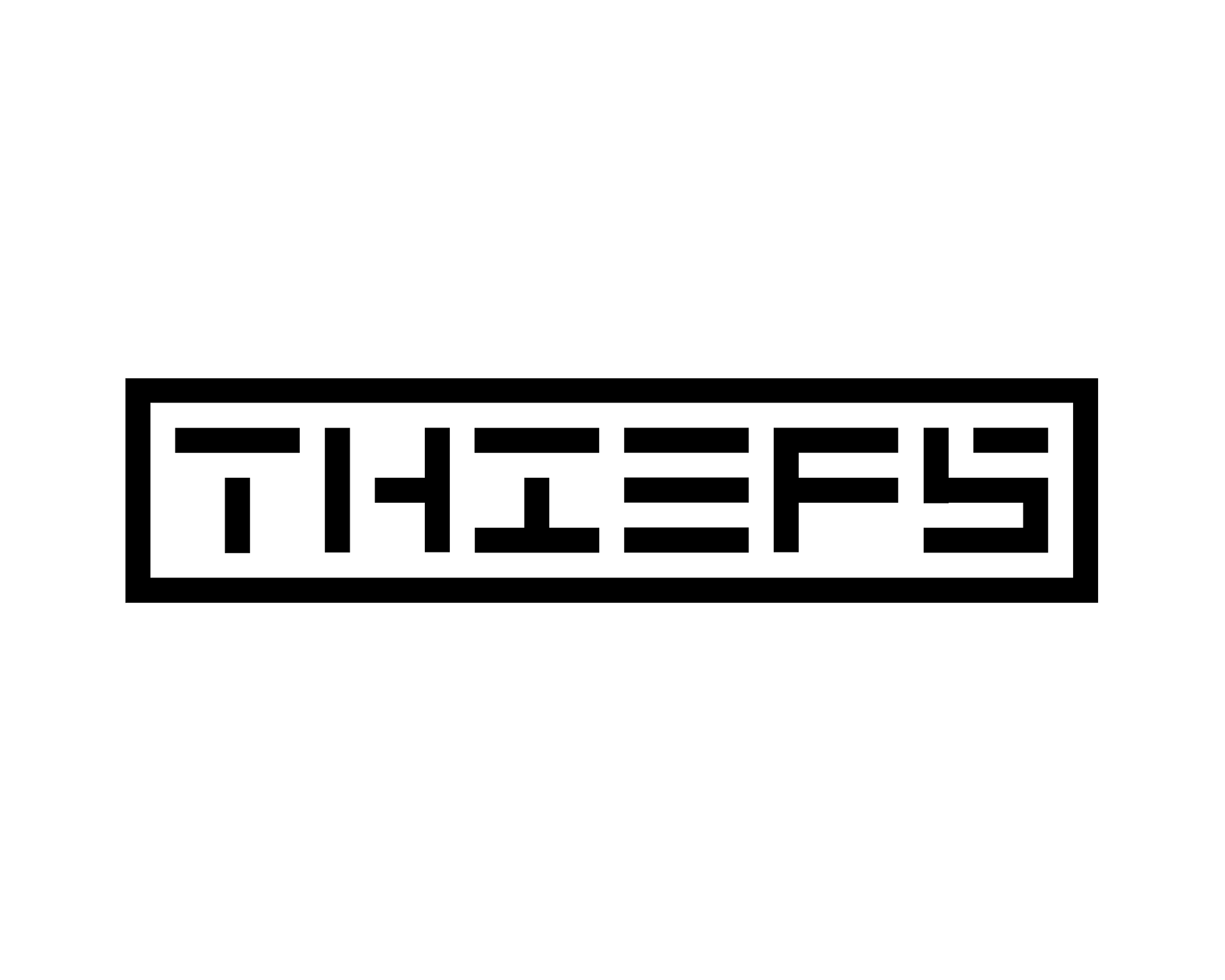
Identity and brand development for a Rock n' Roll Band called the Thiefs. Yes, it's intentionally spelled with an "F".
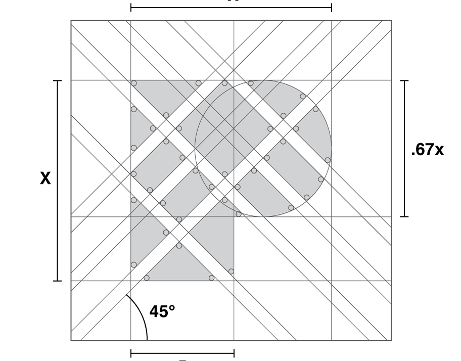
The 3 rows and 3 columns of letters, and the 3 lines in the letter "E" represent the 3 members of the band.
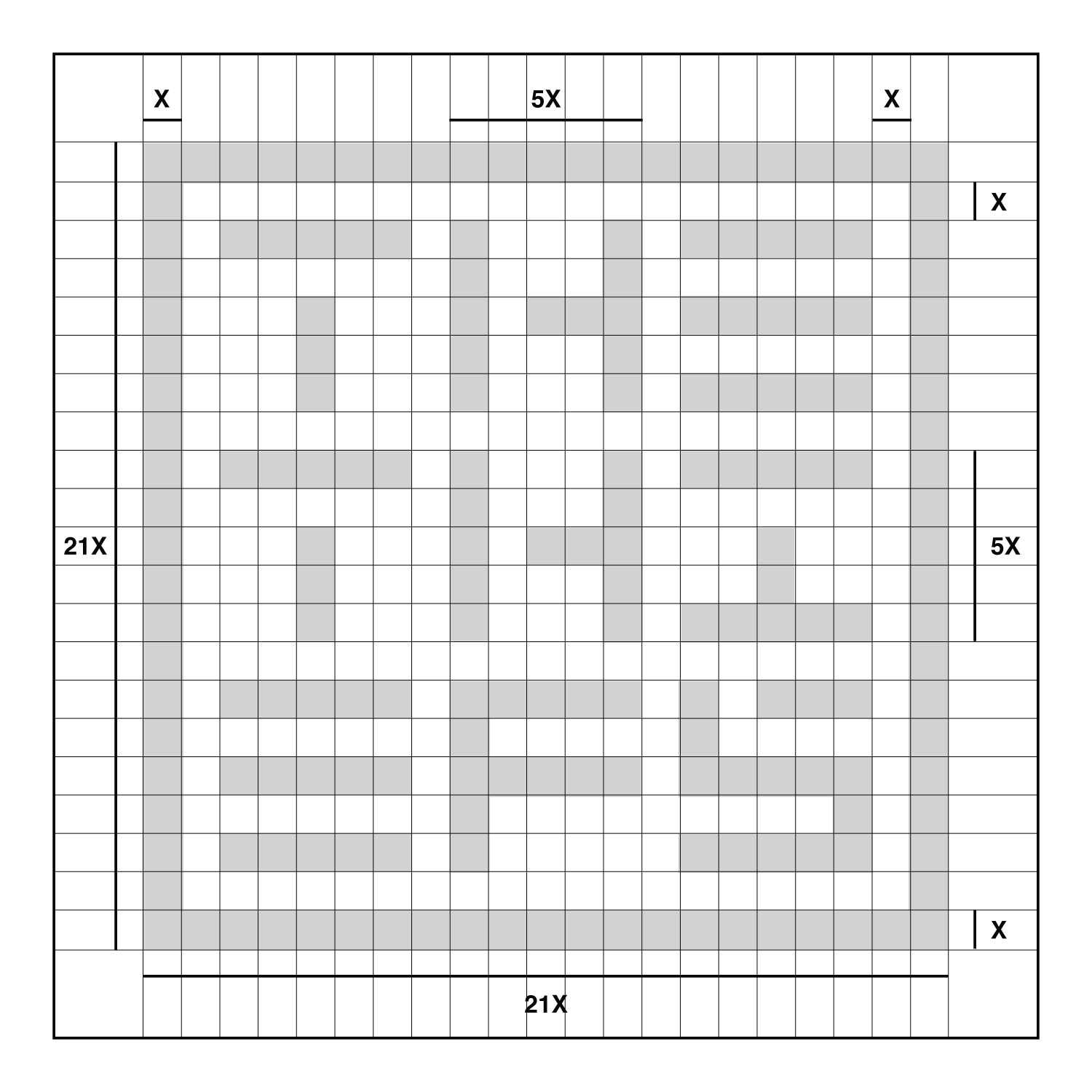
Each individual letter in the logotype is missing a portion of it, representing them being "stolen" as a play on the name of the band (except for the letter F, because it's the part of the name that is intentionally misspelled.)
The 3 rows and 3 columns of letters, and the 3 lines in the letter "E" represent the 3 members of the band.
Each individual letter in the logotype is missing a portion of it, representing them being "stolen" as a play on the name of the band (except for the letter F, because it's the part of the name that is intentionally misspelled.)
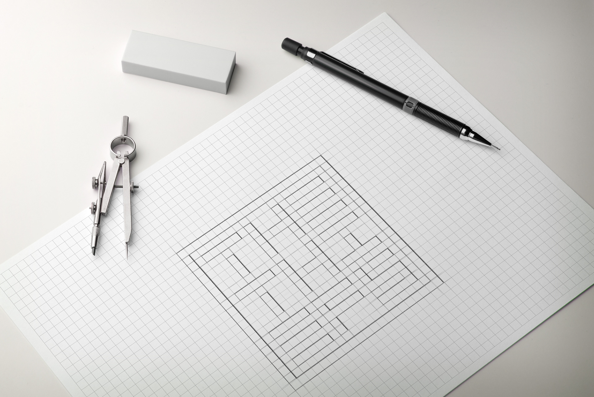
The Thiefs Logotype Sketch
The Thiefs Logotype Illustration
The Thiefs Logotype Design

The Thiefs Logotype Construction Video
The Thiefs Alternate Logotype Illustration

The Thiefs Alternate Vertical Logotype Design
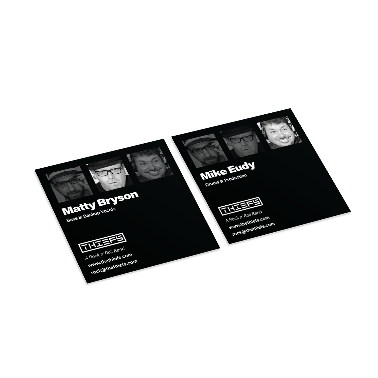
The Thiefs Business Card Design (Front)

The Thiefs Business Card Design (Back)
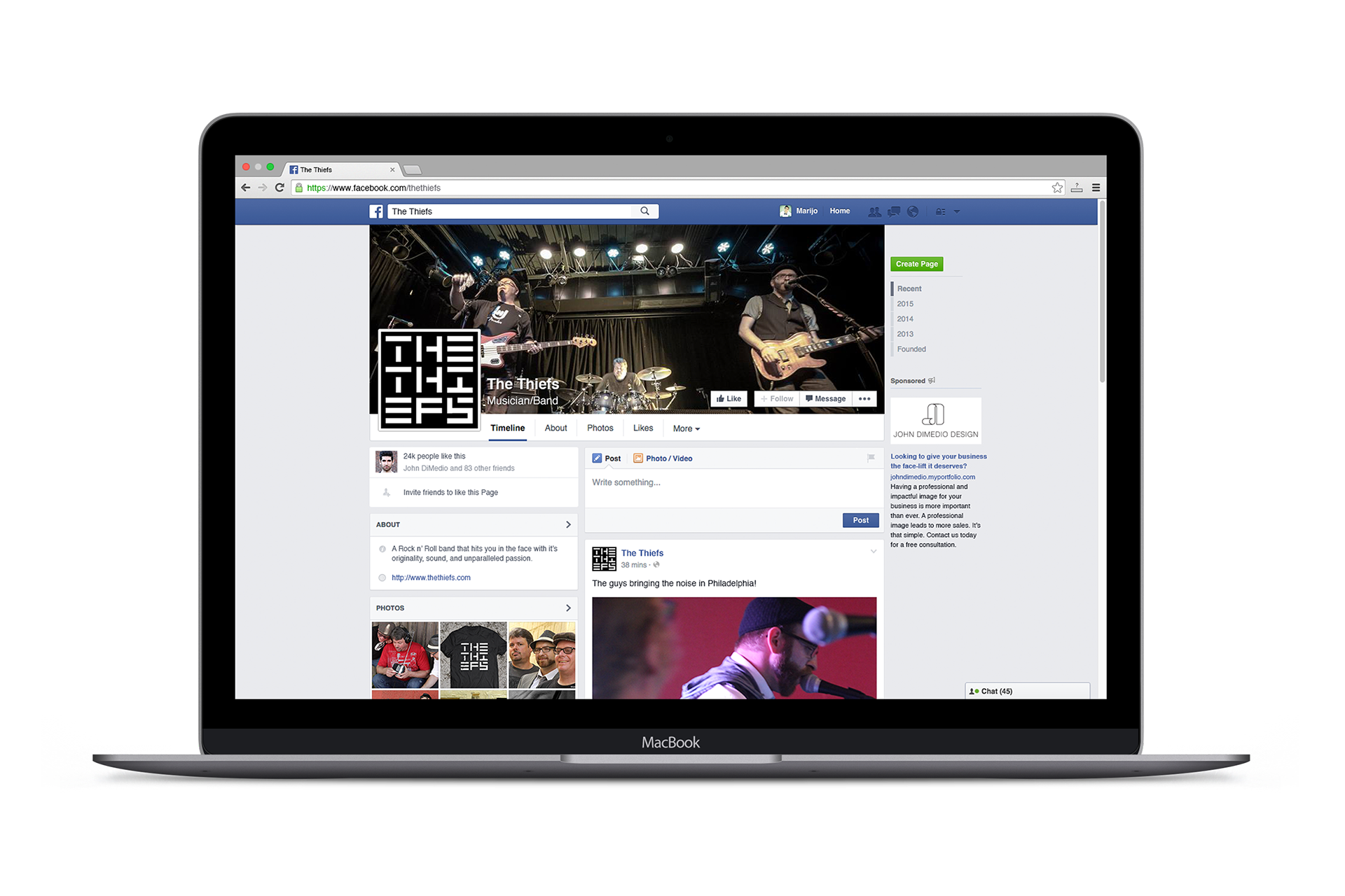
The Thiefs Facebook Page Design
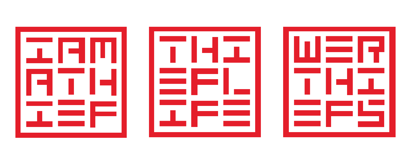
The Thiefs Custom Wording Logotype Applications
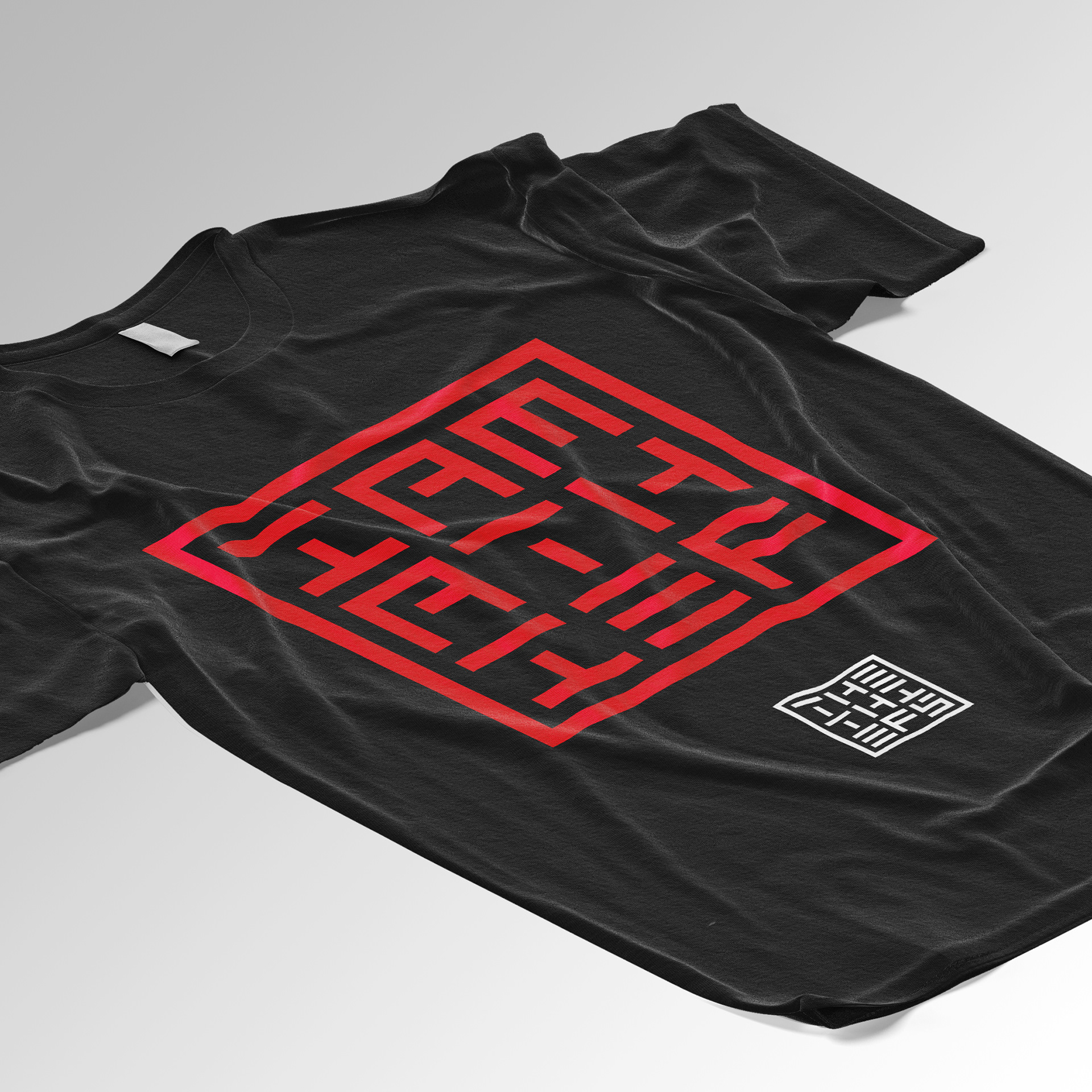
The Thiefs Logotype T-Shirt Application